本文主要介绍了 10 种常用且易于上手的可视化方法,基于python3.7实现。主要使用了两个图形可视化库,matplotlib & seaborn。这两个库的图形效果有细微差别,matplotlib较为流行且支持的可视化图形较多,seaborn也有特有的图形效果,二者搭配使用较佳。
以下提供10种方式的可视化供参考和上手!简单给出示例代码和效果图。
只要记住API的调用方式就能迅速掌握了!
1. 散点图 scatter
1
2
3
4
5
6
7
8
9
10
11
12
13
14
15
| import numpy as np
import pandas as pd
import matplotlib.pyplot as plt
import seaborn as sns
N = 1000
x = np.random.randn(N)
y = np.random.randn(N)
plt.scatter(x, y,marker='x')
plt.show()
df = pd.DataFrame({'x': x, 'y': y})
sns.jointplot(x="x", y="y", data=df, kind='scatter');
plt.show()
|
2. 折线图 plot
1
2
3
4
5
6
7
8
9
10
11
12
13
| import pandas as pd
import matplotlib.pyplot as plt
import seaborn as sns
x = [2010, 2011, 2012, 2013, 2014, 2015, 2016, 2017, 2018, 2019]
y = [5, 3, 6, 20, 17, 16, 19, 30, 32, 35]
plt.plot(x, y)
plt.show()
df = pd.DataFrame({'x': x, 'y': y})
sns.lineplot(x="x", y="y", data=df)
plt.show()
|
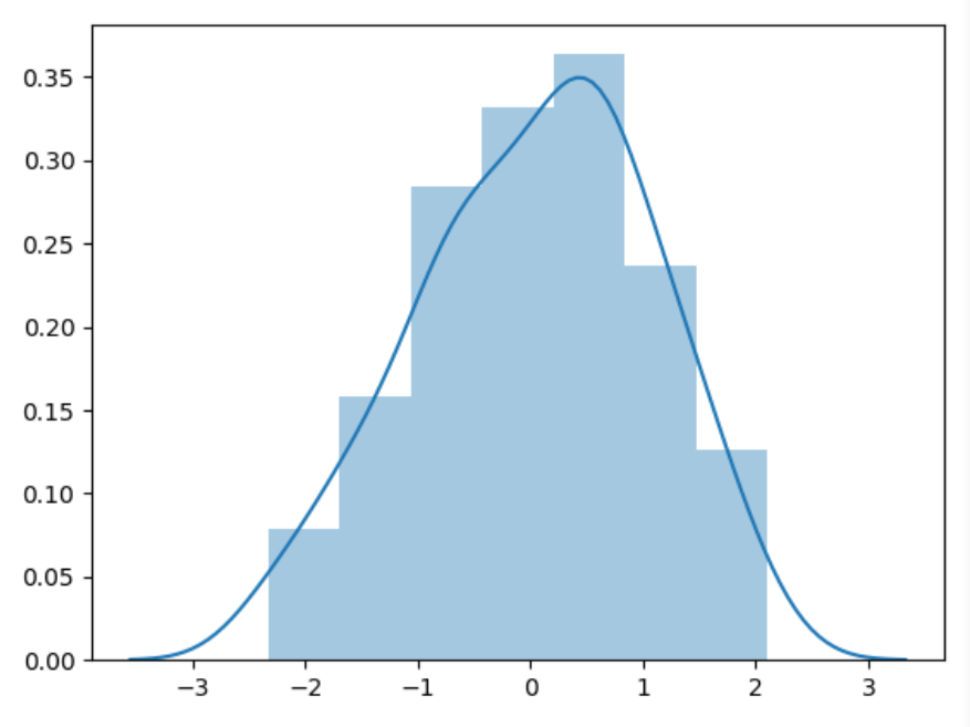
3. 直方图 histogram
1
2
3
4
5
6
7
8
9
10
11
12
13
14
15
| import numpy as np
import pandas as pd
import matplotlib.pyplot as plt
import seaborn as sns
a = np.random.randn(100)
s = pd.Series(a)
plt.hist(s)
plt.show()
sns.distplot(s, kde=False)
plt.show()
sns.distplot(s, kde=True)
plt.show()
|
4. 条形图 bar
1
2
3
4
5
6
7
8
9
10
11
| import matplotlib.pyplot as plt
import seaborn as sns
x = ['Cat1', 'Cat2', 'Cat3', 'Cat4', 'Cat5']
y = [5, 4, 8, 12, 7]
plt.bar(x, y)
plt.show()
sns.barplot(x, y)
plt.show()
|
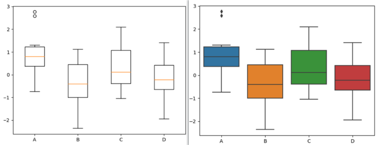
5. 箱线图 boxplot
1
2
3
4
5
6
7
8
9
10
11
|
data=np.random.normal(size=(10,4))
lables = ['A','B','C','D']
plt.boxplot(data,labels=lables)
plt.show()
df = pd.DataFrame(data, columns=lables)
sns.boxplot(data=df)
plt.show()
|
6. 饼图 pie
1
2
3
4
5
6
7
| import matplotlib.pyplot as plt
nums = [25, 37, 33, 37, 6]
labels = ['High-school','Bachelor','Master','Ph.d', 'Others']
plt.pie(x = nums, labels=labels)
plt.show()
|
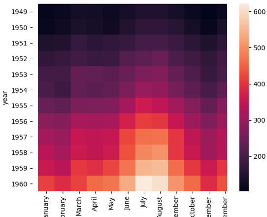
7. 热力图 heat map
较为直观的多元变量分析方法。
1
2
3
4
5
6
7
8
| import matplotlib.pyplot as plt
import seaborn as sns
flights = sns.load_dataset("flights")
data=flights.pivot('year','month','passengers')
sns.heatmap(data)
plt.show()
|
8. 蜘蛛图
1
2
3
4
5
6
7
8
9
10
11
12
13
14
15
16
17
18
19
20
| import numpy as np
import matplotlib.pyplot as plt
import seaborn as sns
from matplotlib.font_manager import FontProperties
labels=np.array([u" 推进 ","KDA",u" 生存 ",u" 团战 ",u" 发育 ",u" 输出 "])
stats=[83, 61, 95, 67, 76, 88]
angles=np.linspace(0, 2*np.pi, len(labels), endpoint=False)
stats=np.concatenate((stats,[stats[0]]))
angles=np.concatenate((angles,[angles[0]]))
fig = plt.figure()
ax = fig.add_subplot(111, polar=True)
ax.plot(angles, stats, 'o-', linewidth=2)
ax.fill(angles, stats, alpha=0.25)
font = FontProperties(fname=r"C:\Windows\Fonts\simhei.ttf", size=14)
ax.set_thetagrids(angles * 180/np.pi, labels, FontProperties=font)
plt.show()
|
9. 二元分布图
1
2
3
4
5
6
7
8
9
10
| import matplotlib.pyplot as plt
import seaborn as sns
tips = sns.load_dataset("tips")
print(tips.head(10))
sns.jointplot(x="total_bill", y="tip", data=tips, kind='scatter')
sns.jointplot(x="total_bill", y="tip", data=tips, kind='kde')
sns.jointplot(x="total_bill", y="tip", data=tips, kind='hex')
plt.show()
|
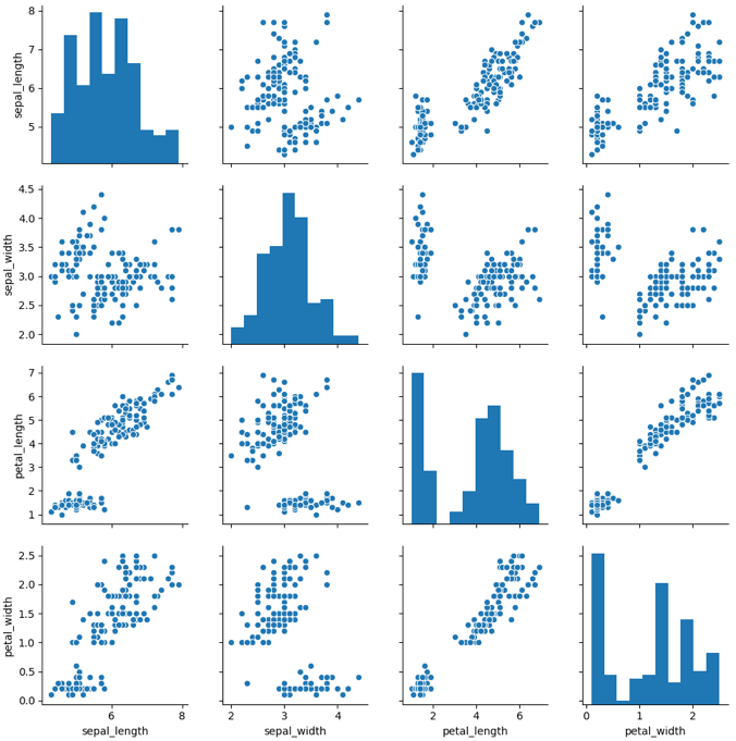
10. 成对关系图
1
2
3
4
5
6
7
| import matplotlib.pyplot as plt
import seaborn as sns
iris = sns.load_dataset('iris')
sns.pairplot(iris)
plt.show()
|
这里我们用 Seaborn 中的 pairplot 函数来对数据集中的多个双变量的关系进行探索,如下图所示。从图上你能看出,一共有 sepal_length、sepal_width、petal_length 和 petal_width4 个变量,它们分别是花萼长度、花萼宽度、花瓣长度和花瓣宽度。
下面这张图相当于这 4 个变量两两之间的关系。比如矩阵中的第一张图代表的就是花萼长度自身的分布图,它右侧的这张图代表的是花萼长度与花萼宽度这两个变量之间的关系。
更多可视化示例可参考matplotlib 官网上的例子。https://matplotlib.org/gallery/index.html